Design That Packs a Punch
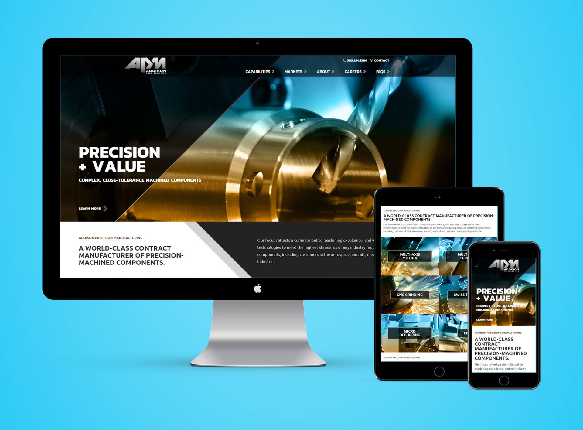
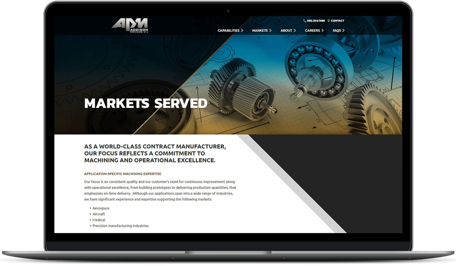
Addison's viscerally engaging website uses clever geometric design elements such as shield-like diagonal lines to grab attention and increase user engagement.

A Striking Showcase
The unique use of diagonal lines builds tension and points the user down toward both the call-to-action and the additional content which resides below the fold.

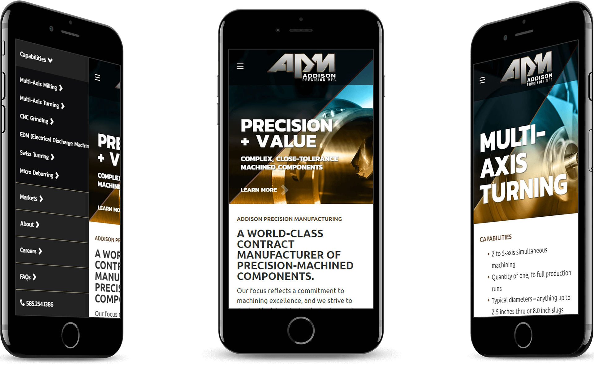
Engaging Mobile Design
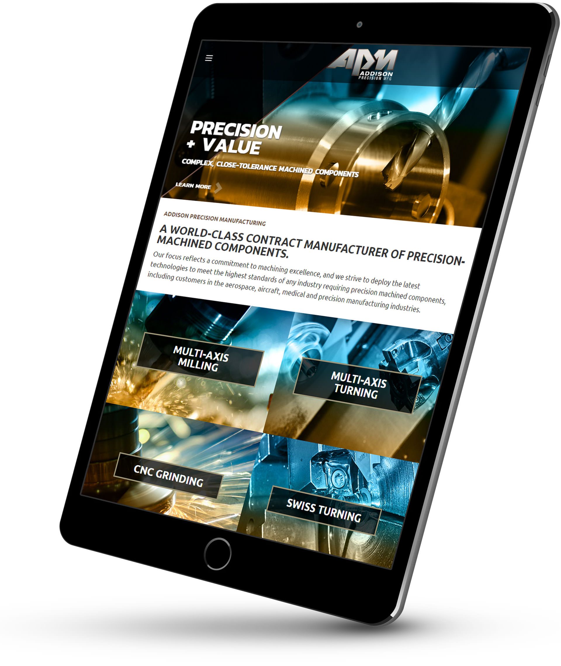
The ability to view the website effectively on mobile maximizes the total impact on customers and prospects.

Framed for Success
High quality images and sharp diagonal lines act as framing devices and visual cues for users.
